Mare Island Brewing Company
About
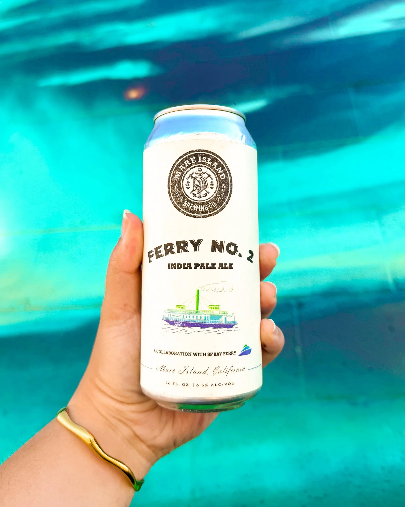
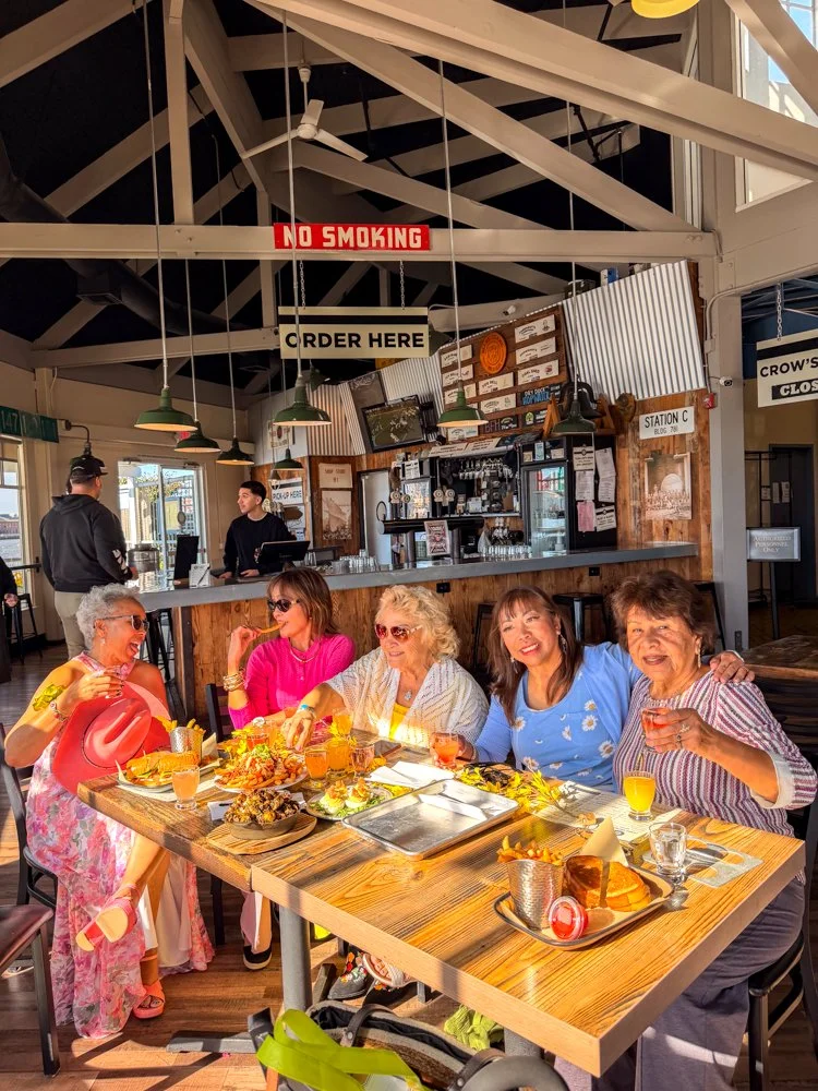
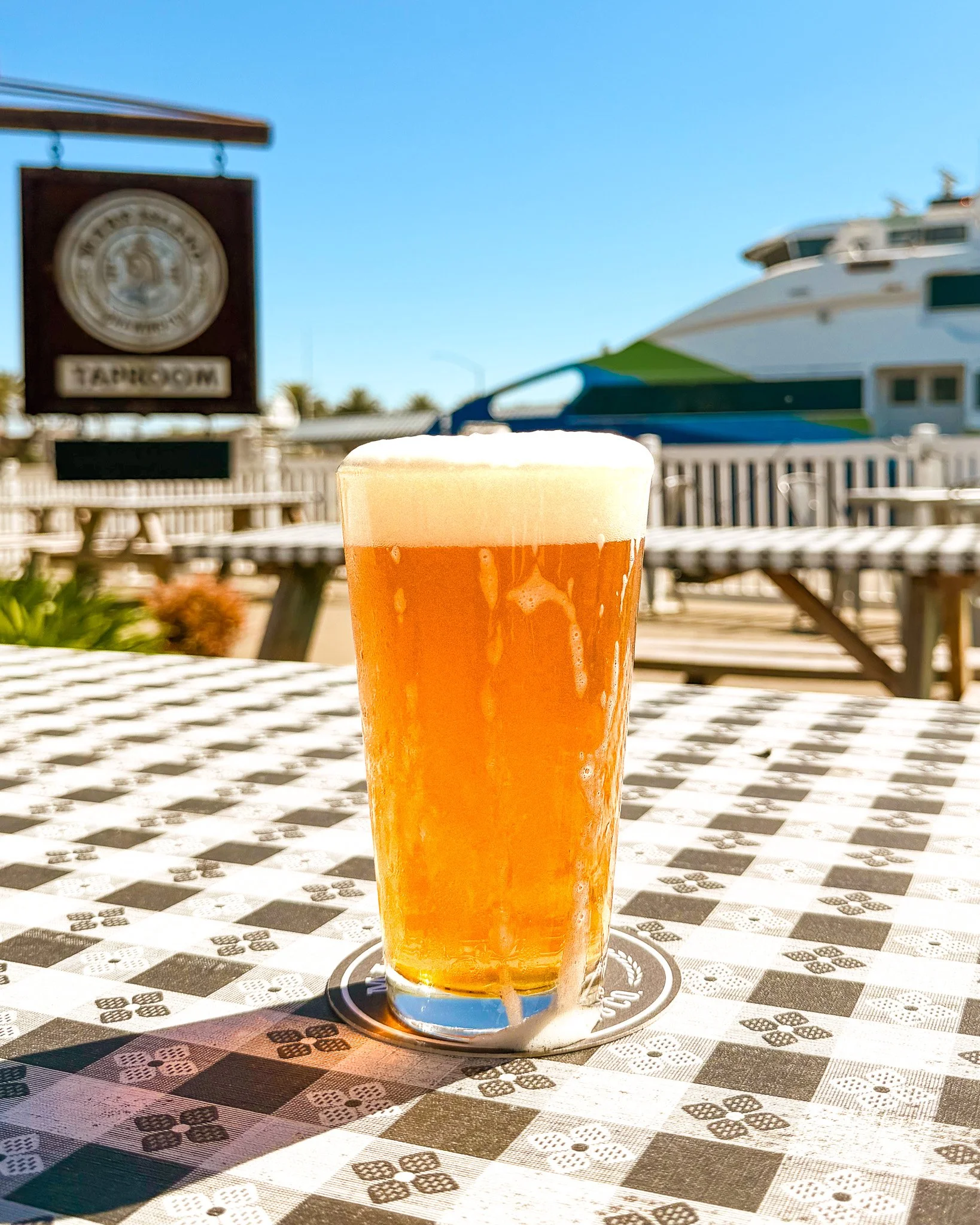
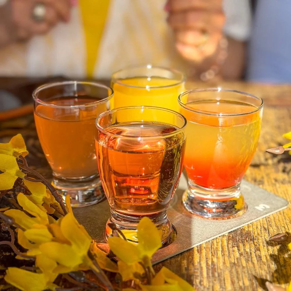
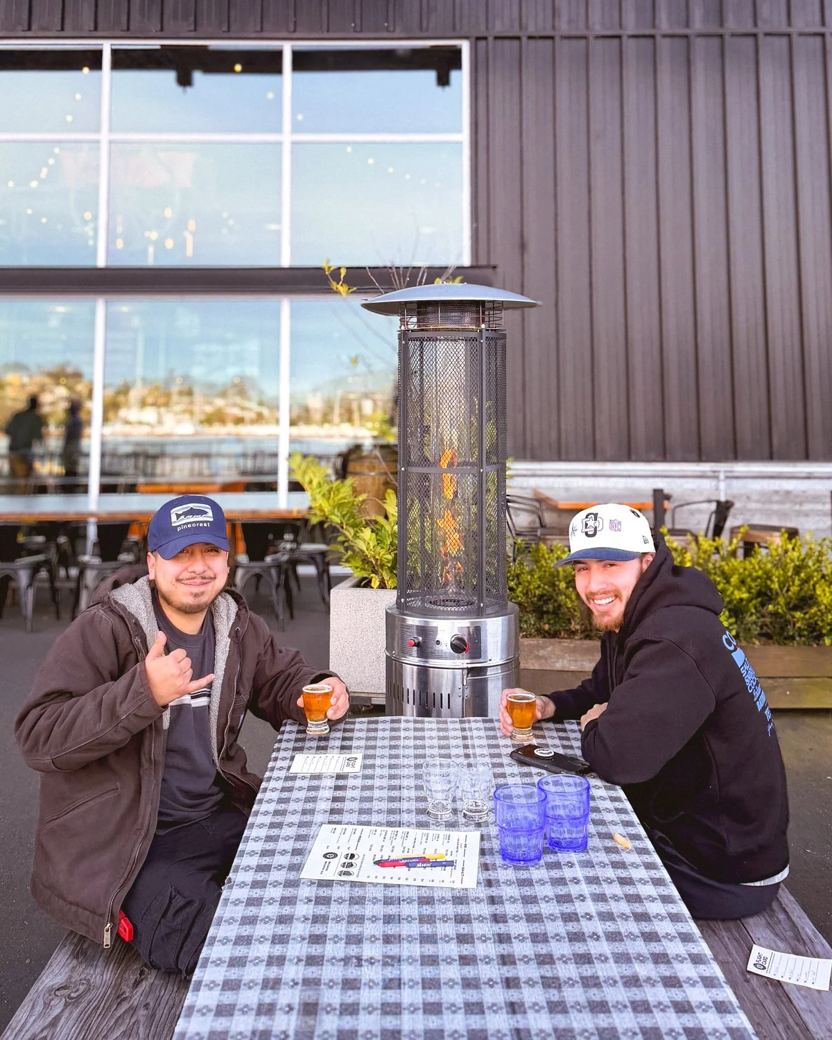
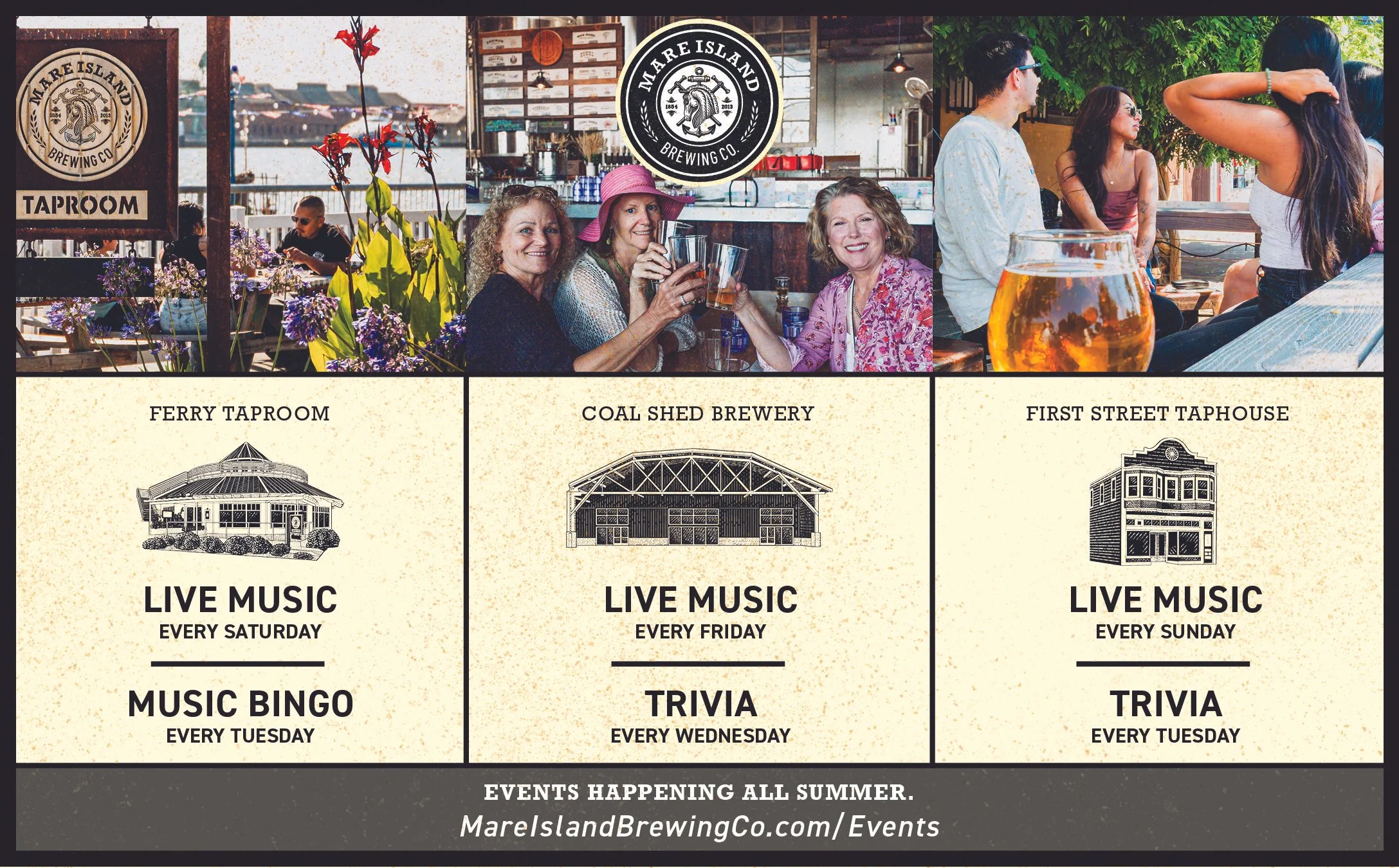
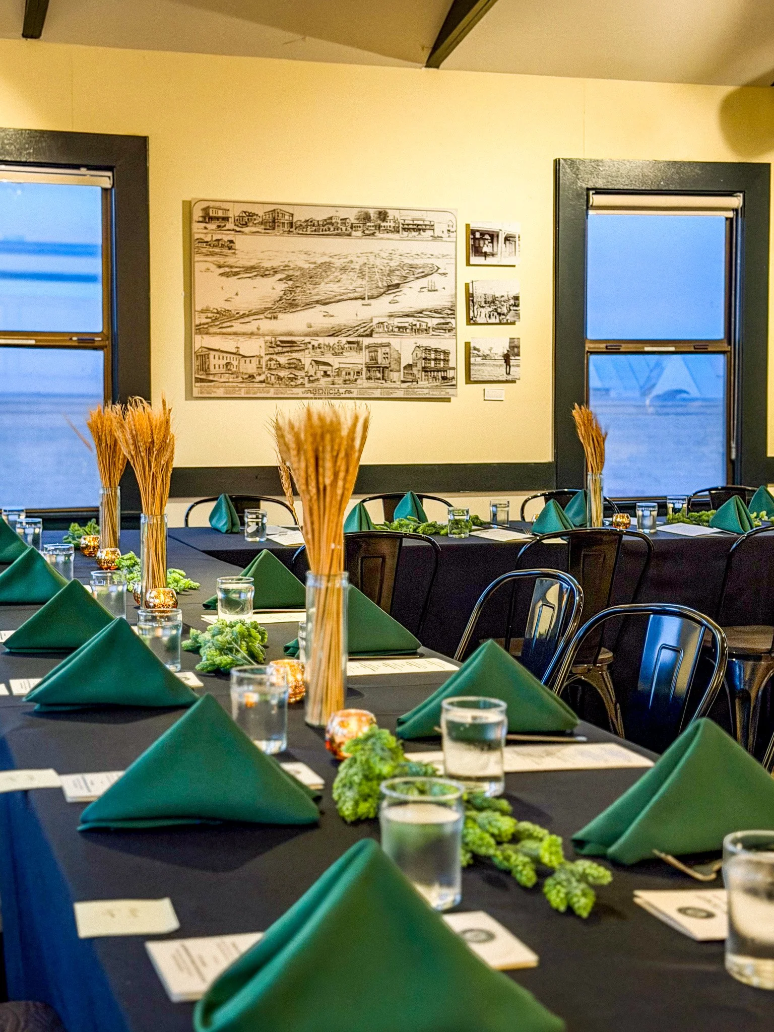
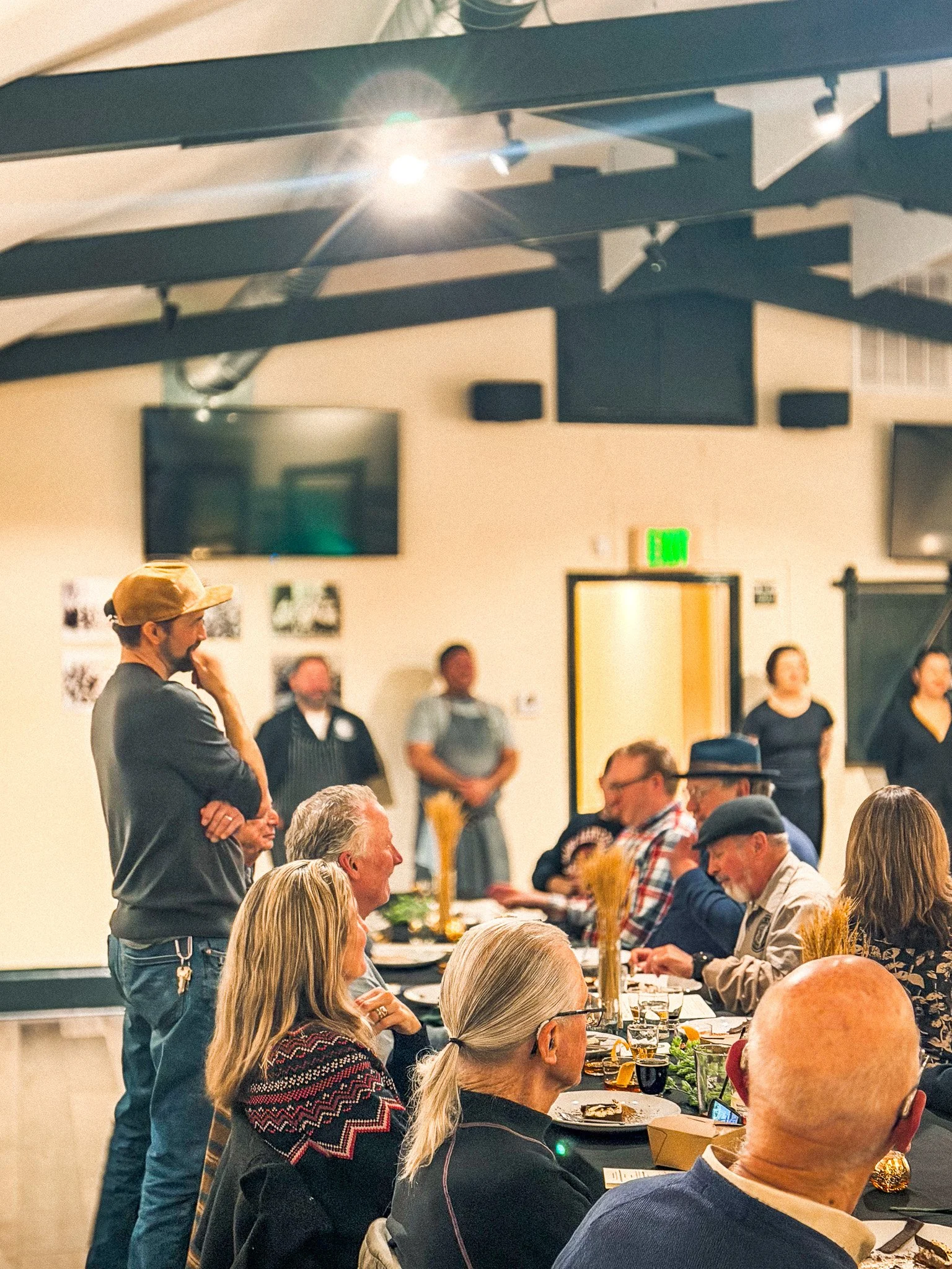
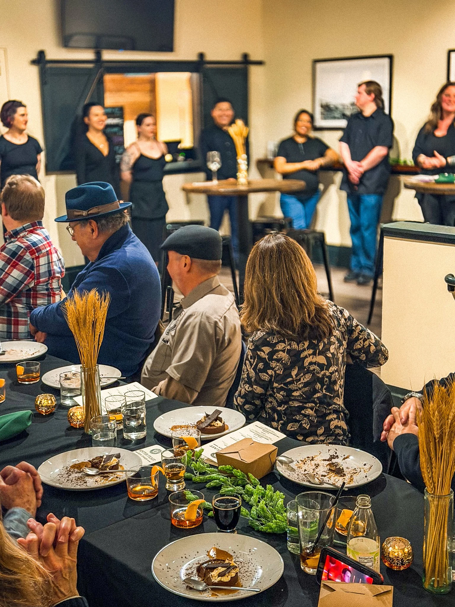
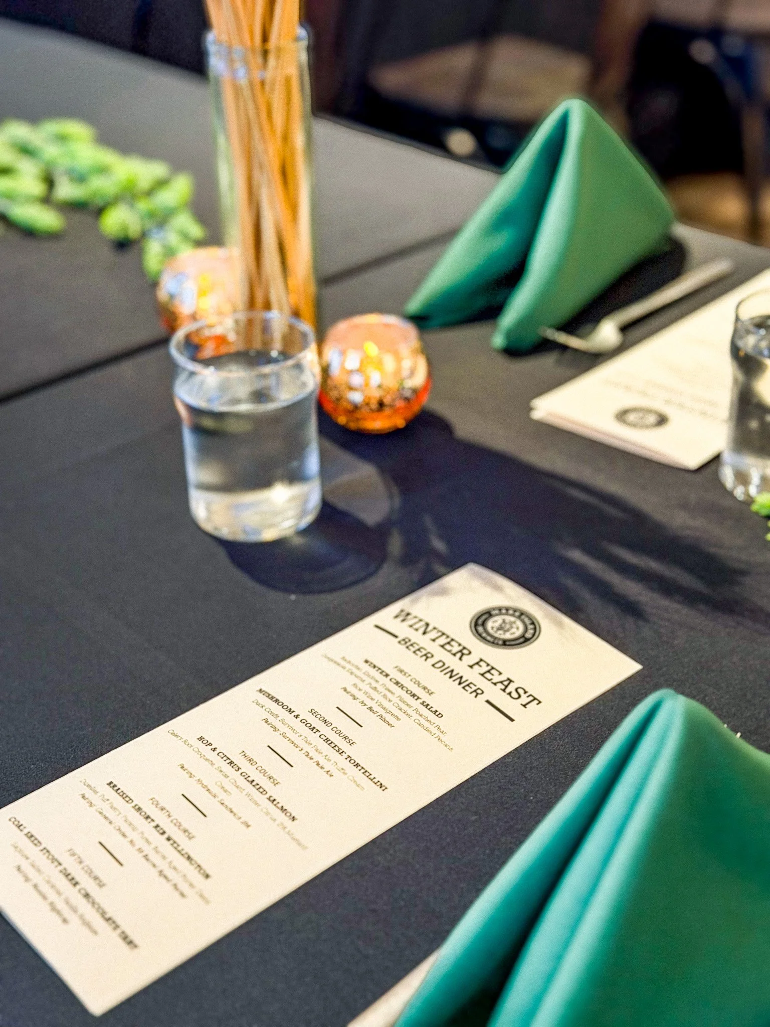
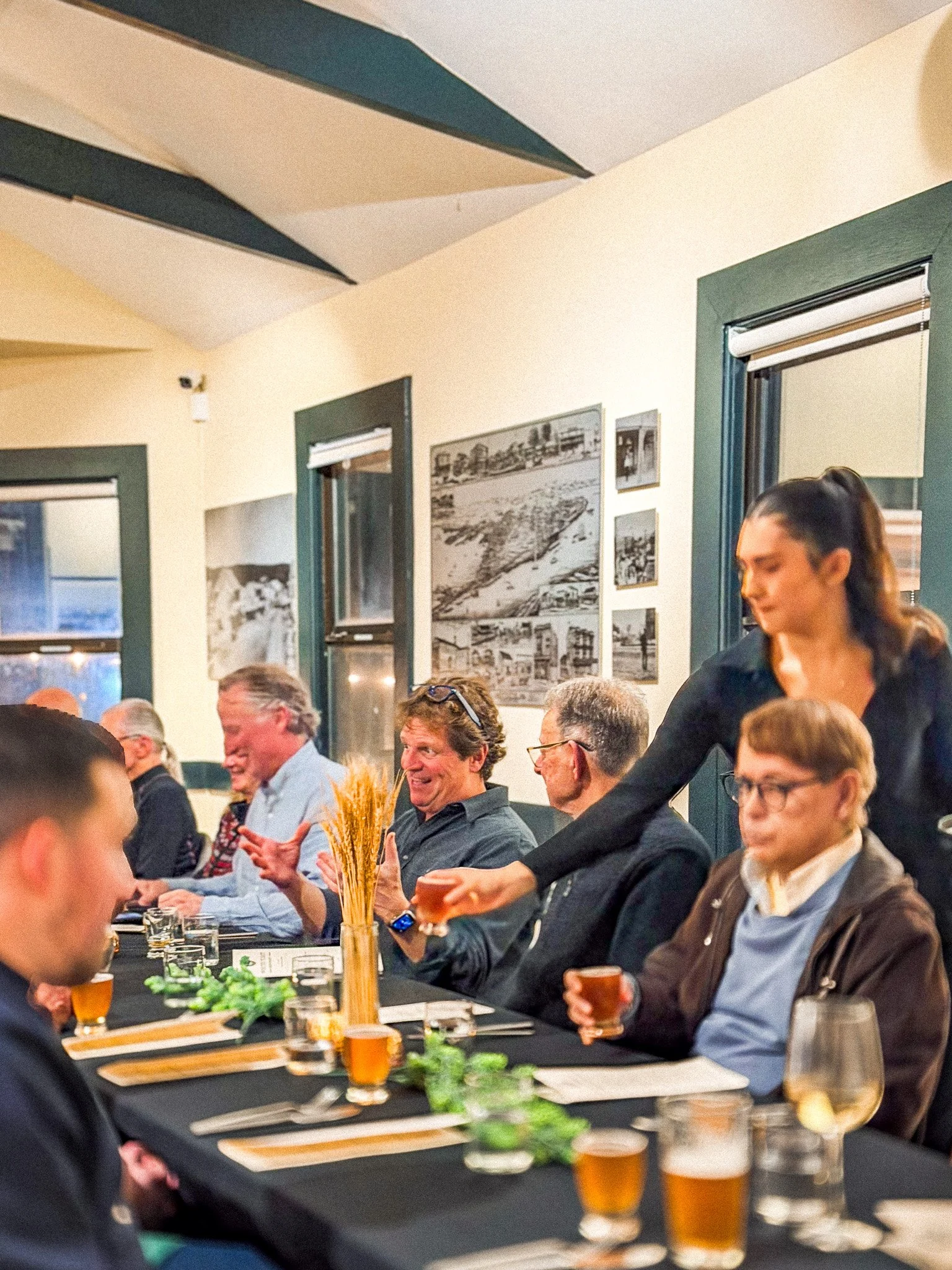
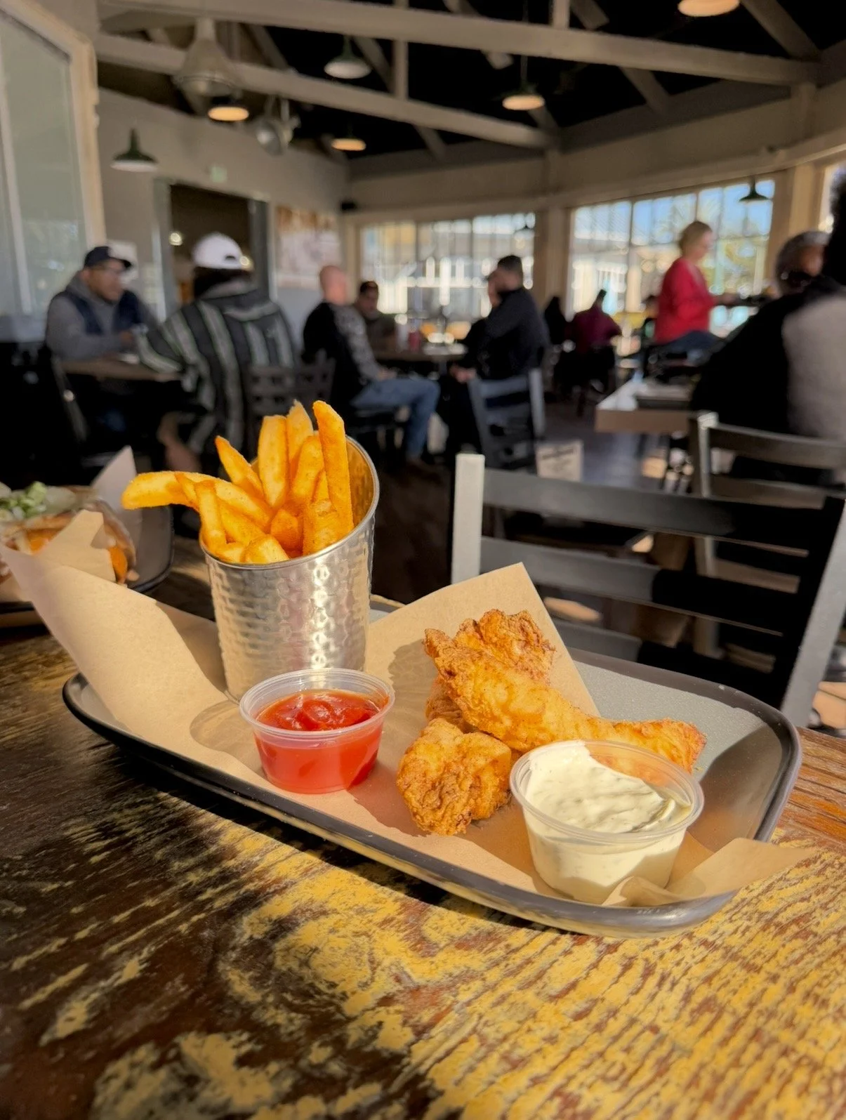
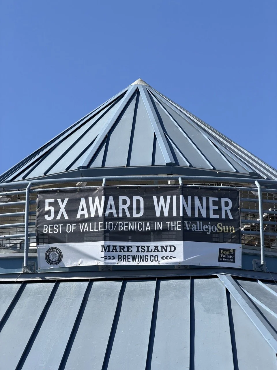
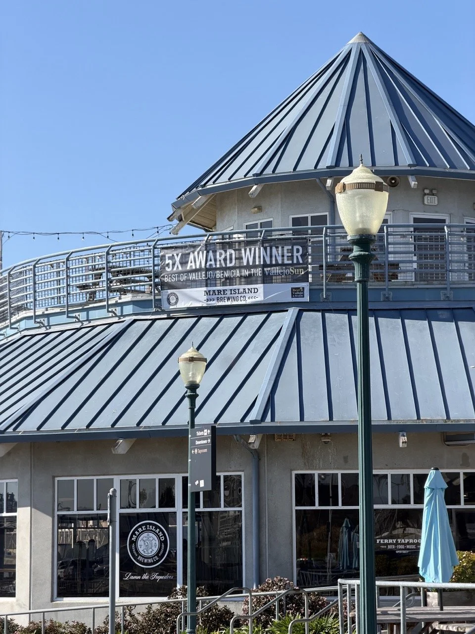
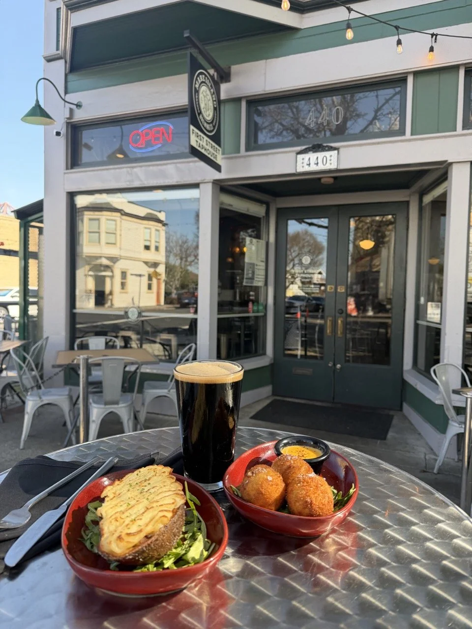
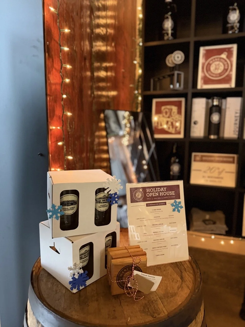
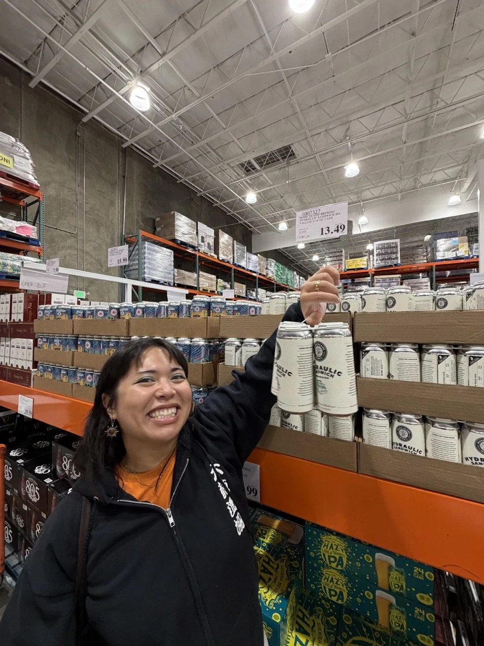
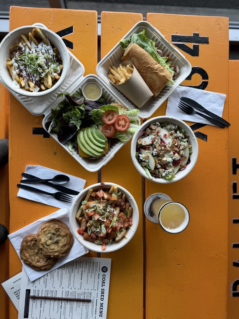
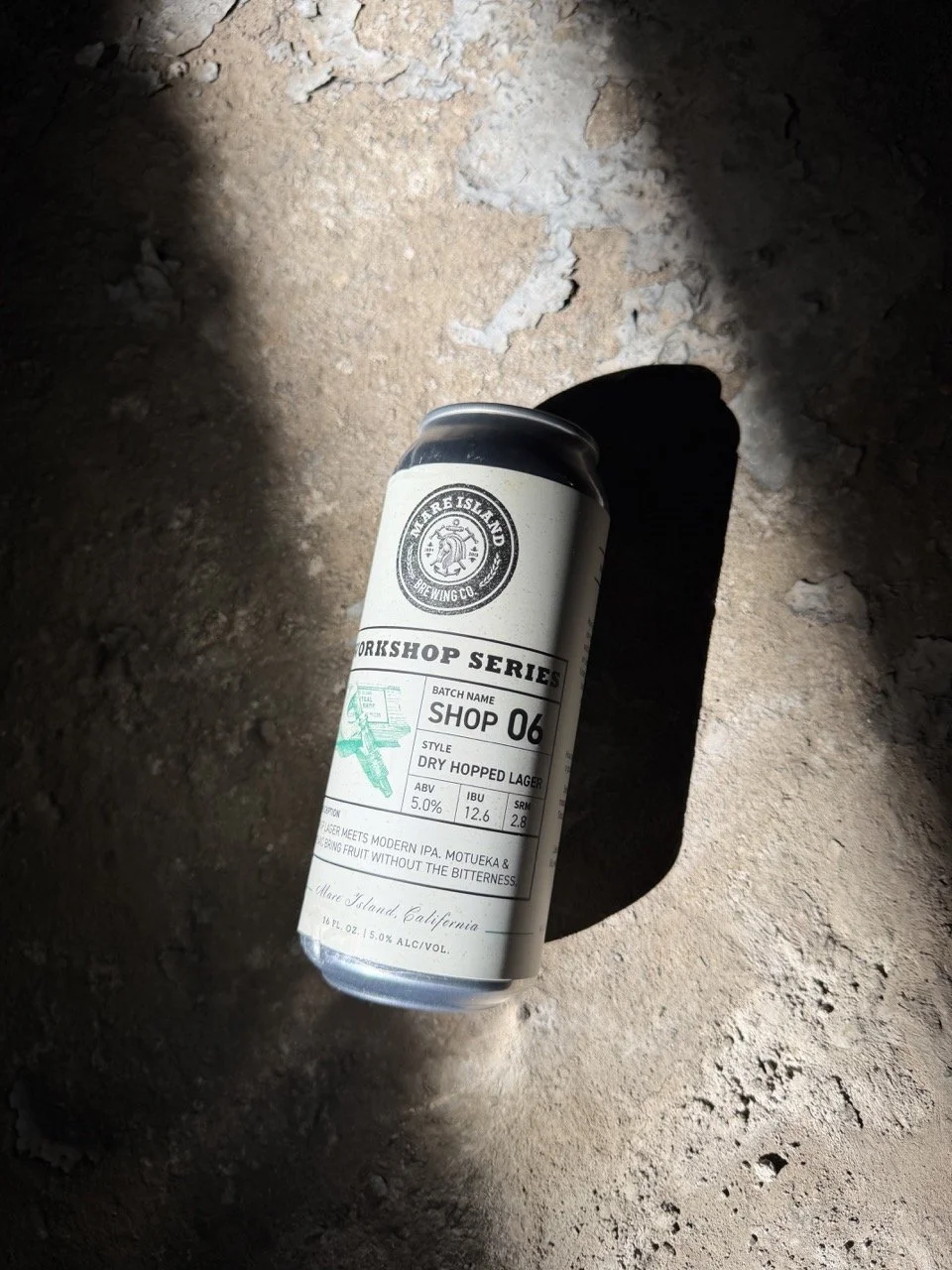
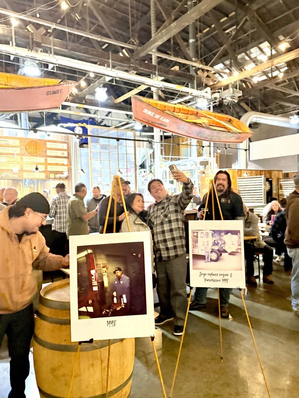
Mare Island Brewing Co. is an independent craft brewery rooted in the rich history of Mare Island, one of the West Coast's most storied naval shipyards. Known for bold, quality craft beer and a deep connection to the Vallejo community, they operate three taproom locations and a passionate Beer Club membership program.
Mission
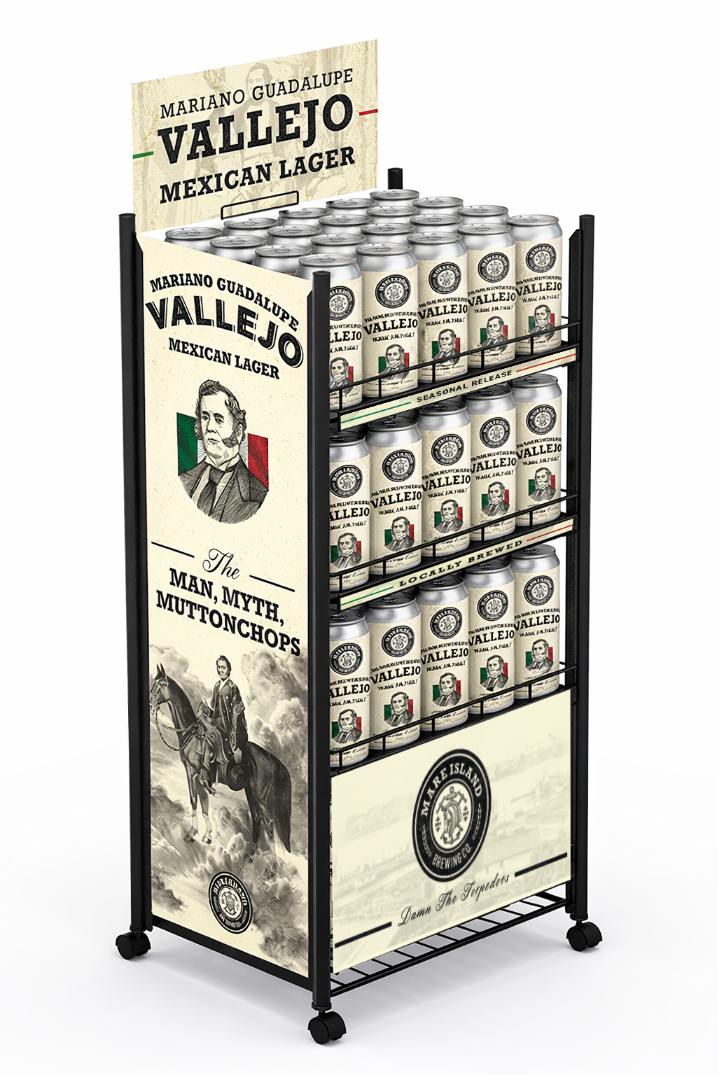
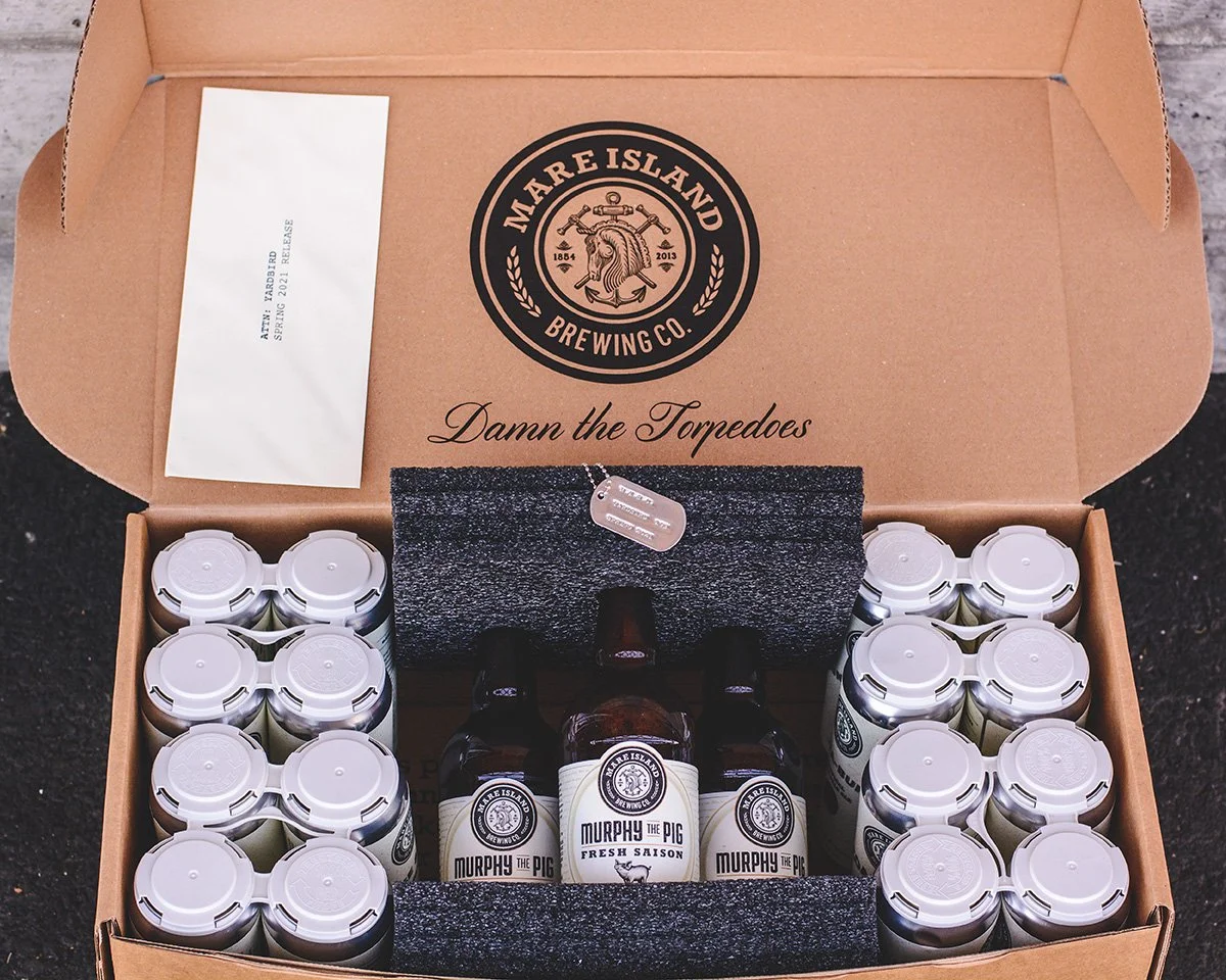
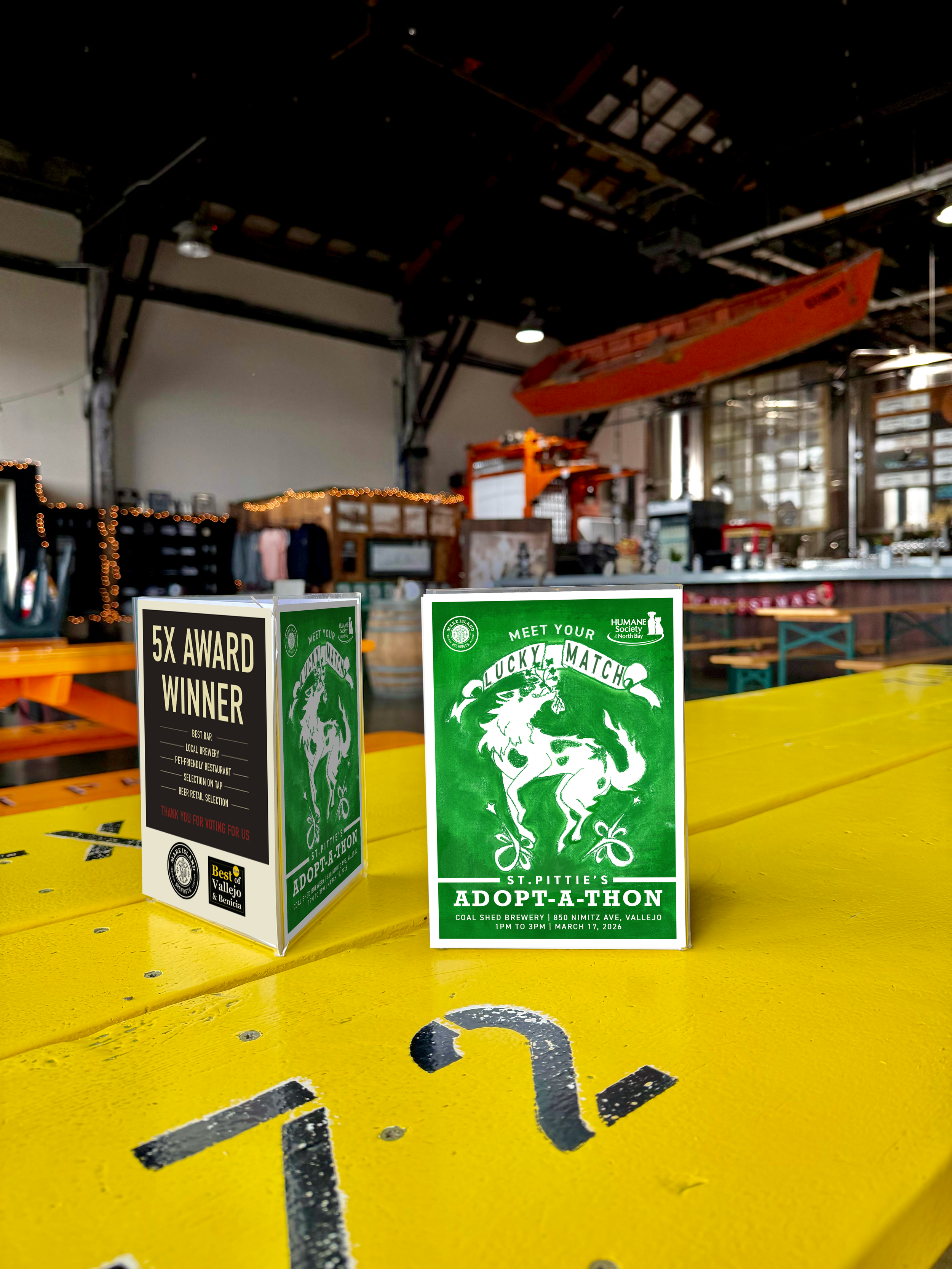
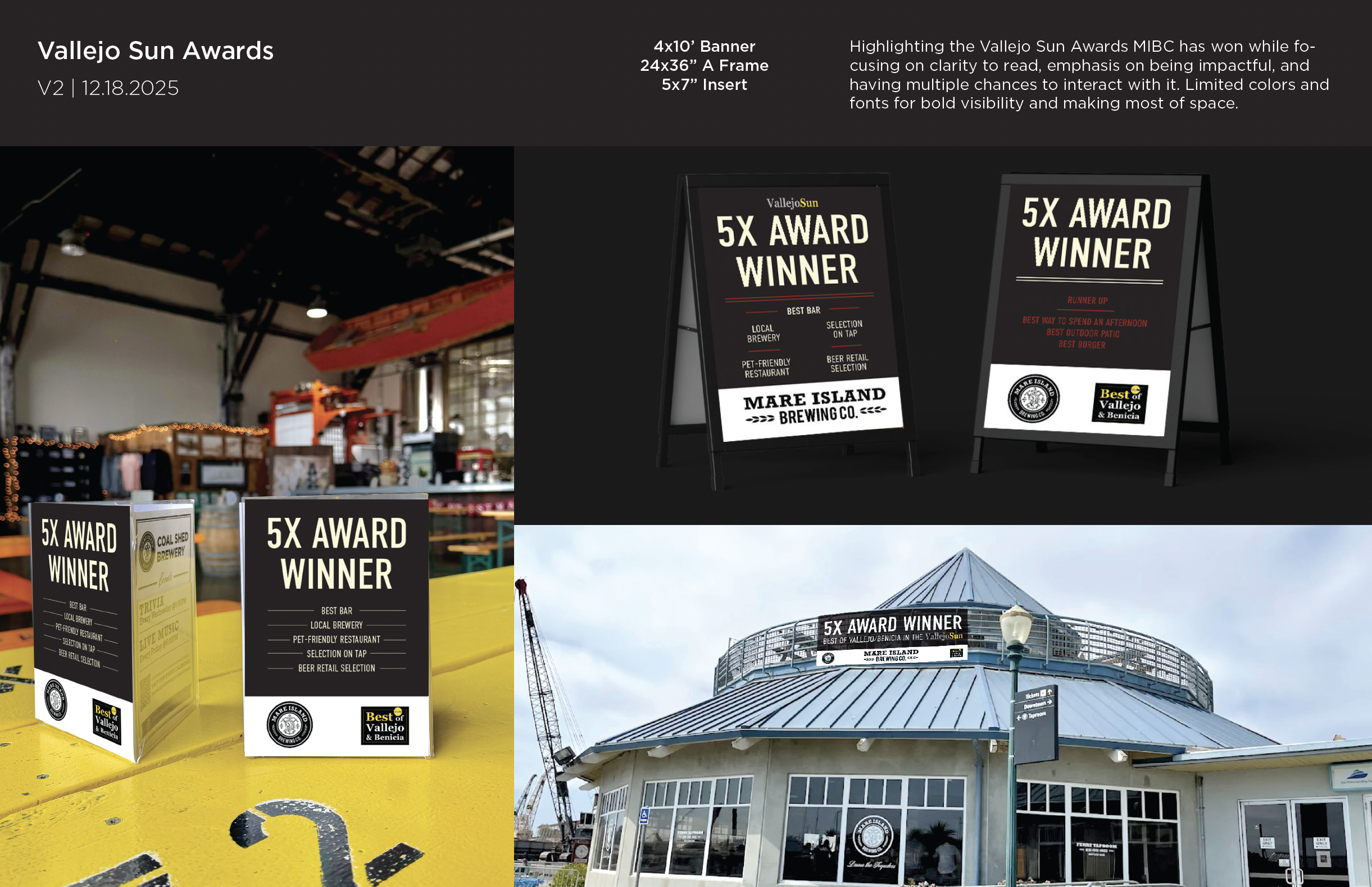
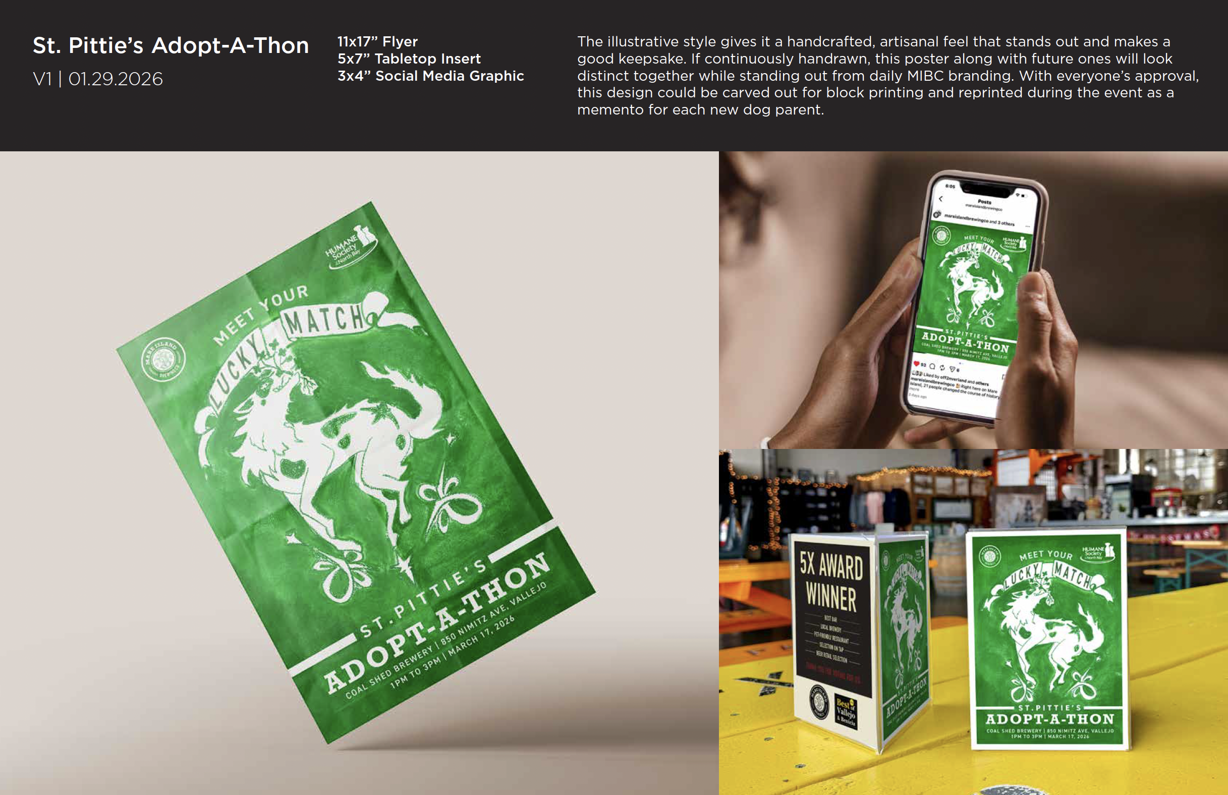
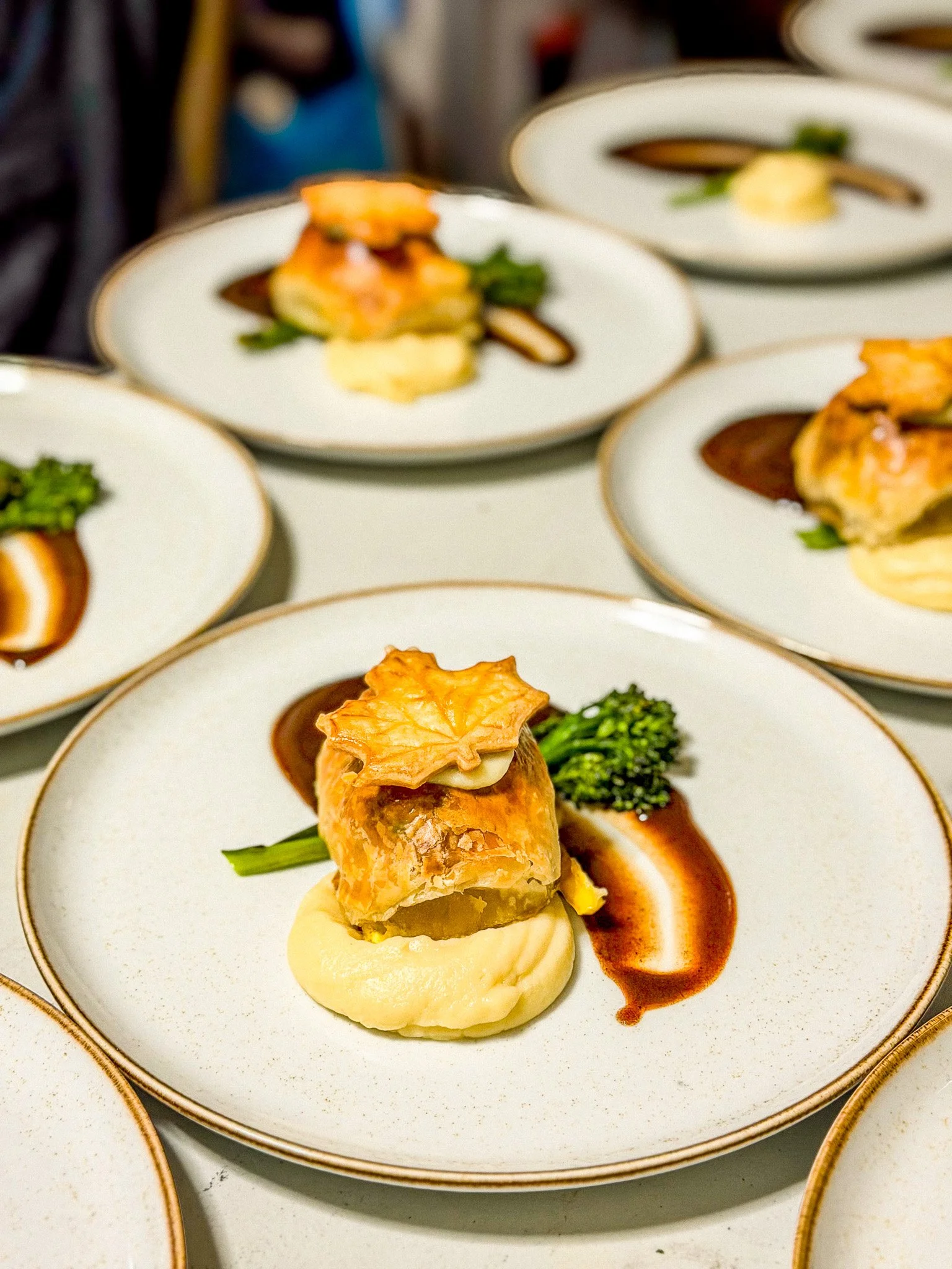
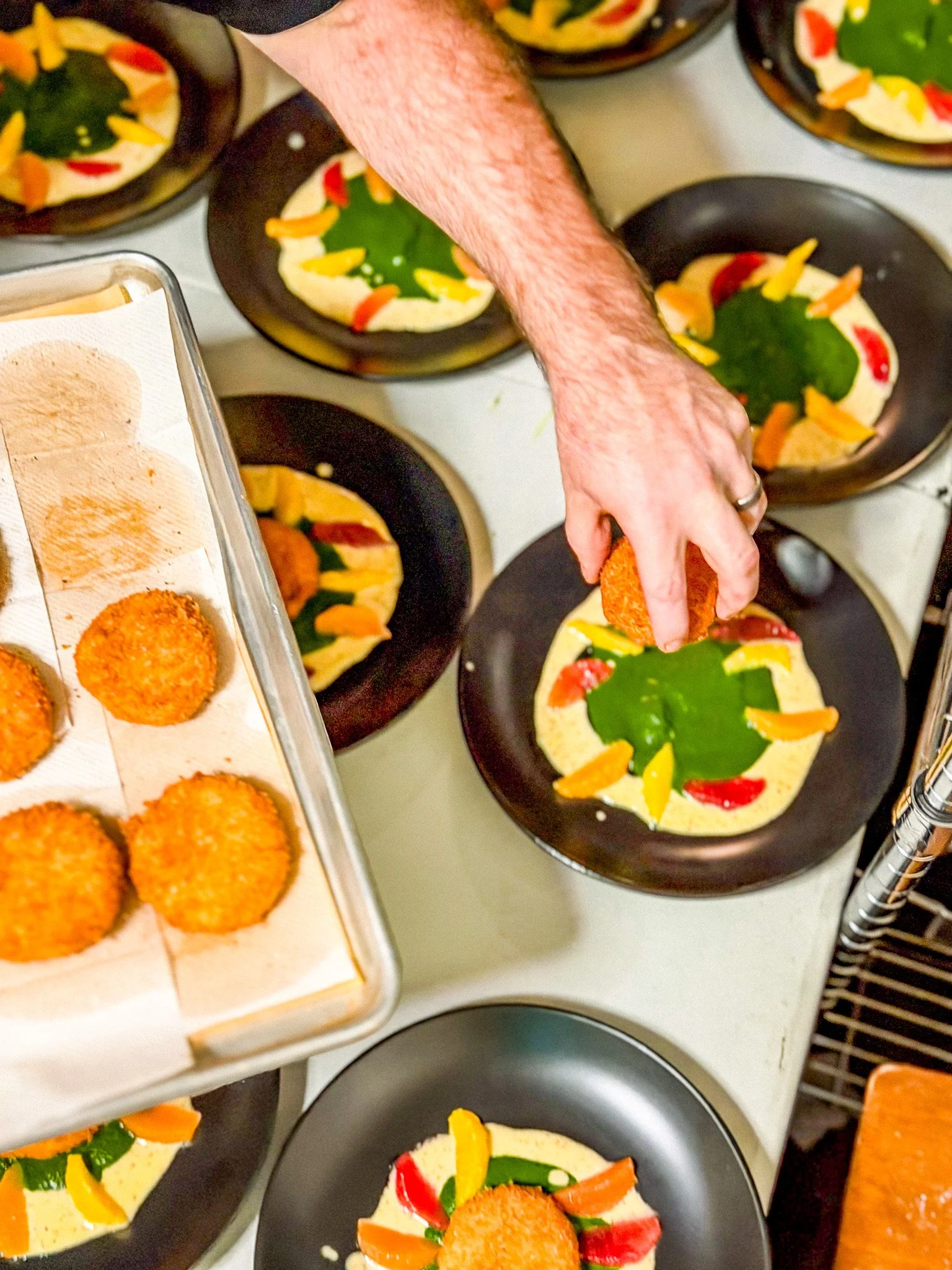
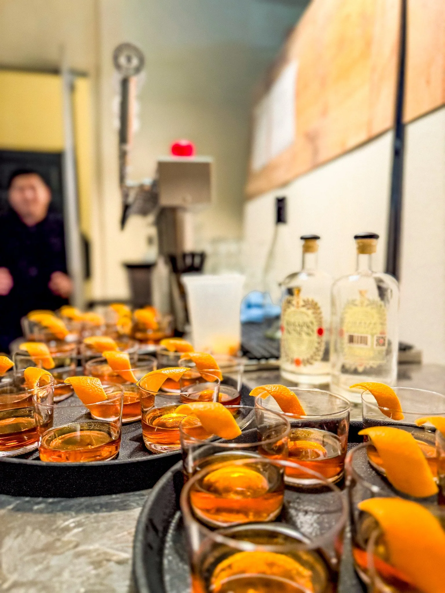
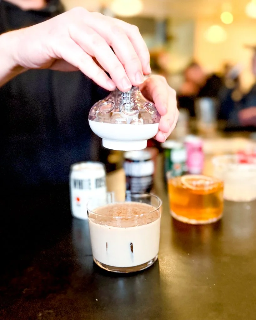
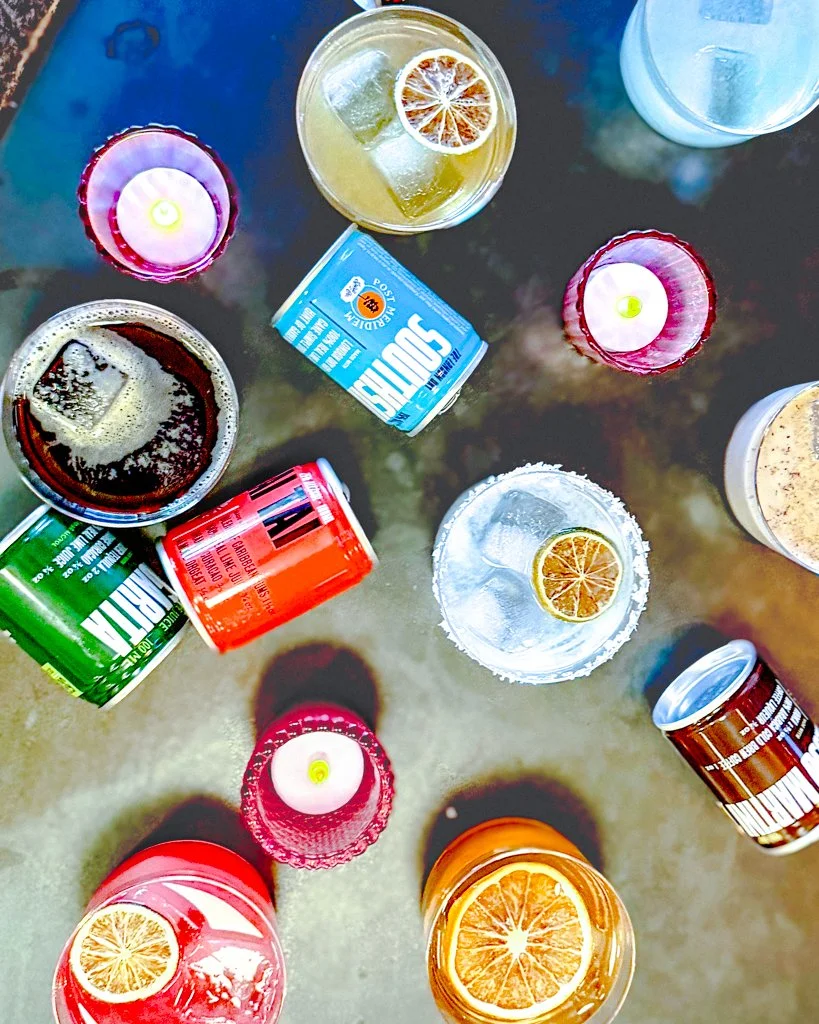
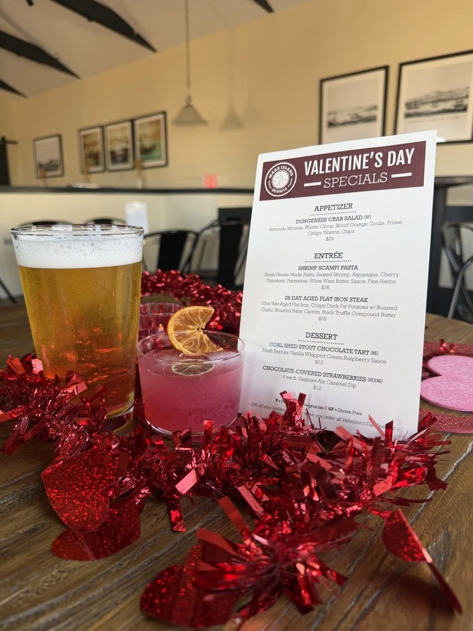
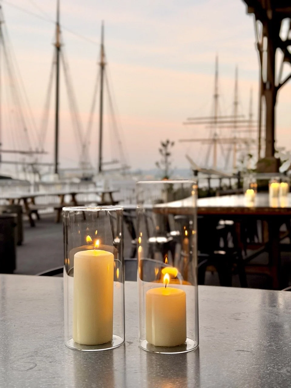
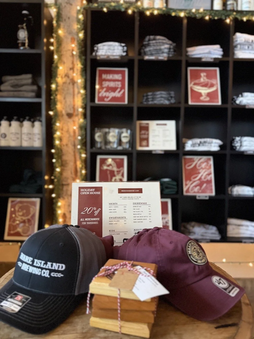
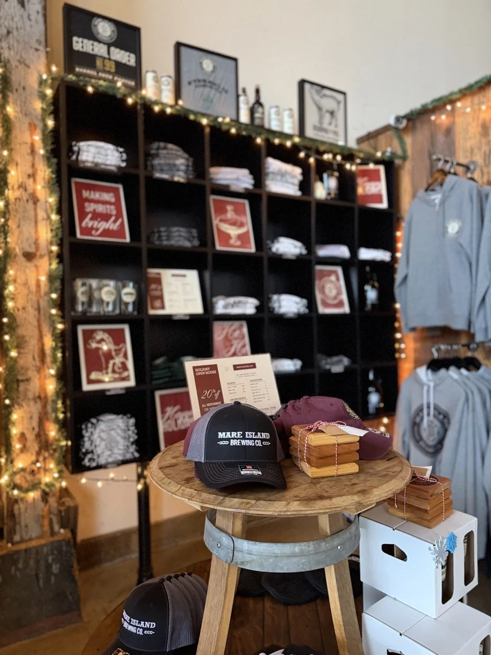
In my role as Creative Marketing Coordinator, I serve as the primary creative force behind the brand's day-to-day presence and long-term visual identity. I manage marketing campaigns end-to-end — spanning newsletters, advertisements, social media across three locations, print and digital materials, photo and video shoots, and off-site displays — while also handling the bulk of operational upkeep like menu updates, functional materials for all locations, and cross-functional meetings. Working within strict brand guidelines, I find and create opportunities to push the creative as far as it can go, art directing and producing assets that keep the brand feeling alive, consistent, and compelling. From illustration to event creative direction to on-site photography, I wear a lot of hats and take pride in making sure everything that goes out the door looks sharp and tells the right story.
graphic designMarketingsocial media management